
I saw this poster the other day, and something hit me. It’s backwards. The data you are analyzing is only as good as your analysis techniques.
Strategic Management of Design Systems
We used simply to call them “style guides” and they started as a simple PDF to illustrate color shape and state usage authored mostly for the few front end designers and developers who could use such a document. And those style guides were easy to manage when there were precious few people actually creating elements and using them. But what happens when you add a CMS, and your social media managers and marketing department can now create and publish design elements? Or when your organization numbers into the hundreds or thousands? Enter design systems and the need for their governance.


An original design.

The design when the design system is ignored.
Collaboration is key
Design systems have evolved from PDF documents to have the ability to provide a much more granular level of detail for those design components and how they should act in any environment, which should be your focus before committing them to the library proper. This isn’t just – ‘let’s grind away and imagine how many variations could possibly exist within said component(s)’ but rather, working group sessions to discuss and to help decide as rationally as possible….’do we need to make room for “x” in the future?’, and ‘does this meet our needs currently?’.
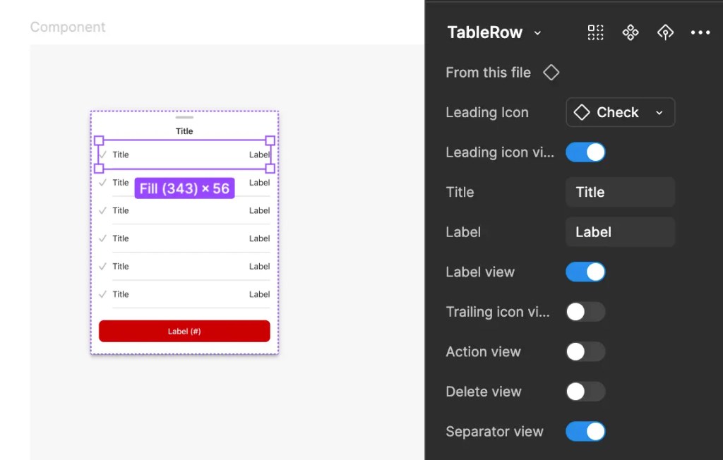
An example of a Figma table component and it’s variants
Preventing reverse evolution
It is easy enough now-a-days using tools such as Figma to create a design system. Whereby designers only use vetted components with proper states which have been reviewed for accessibility standards. But don’t we still have the possibility of the cowboy-like cavalier creation of non-spec components?
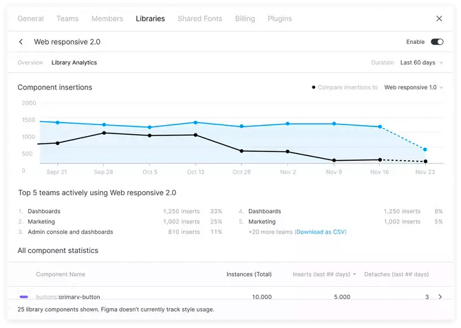
Figma offers some basic stats on your design system usage within the app if you are subscribed at the Organization Plan level, so we can see what is being used and how often.
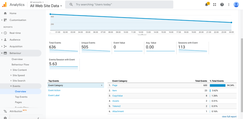
But what about things slipping through the cracks? We can use additional analytics tools such as Adobe’s to measure our created Figma tokens if they are properly named.
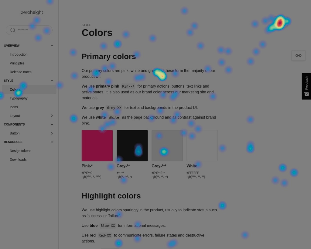
Have you thought about using a heatmap for your documentation site?
Adoption can be measured internally, from gathering stats on who requests access to libraries, down to your style guide documentation to measure who’s reading what, to inform you on where even scannability may be an issue (is documentation too sparse, too verbose?) and problems can be analyzed to improve performance or chase out difficult elements (are they coming back here repeatedly because documentation does not match the design element?).
Beyond atomicity
So you’ve got your atoms, molecules and components set up. Don’t forget that screens and flows also need documentation to ensure elements are being used correctly in conjunction.
How to organize pattern documentation:
Purpose: Explain why the pattern exists and how to use it.
Anatomy: Describe the different parts of the pattern.
Behavior and Interaction: Share how the pattern works and how users should interact with it.
Code and Design Specifications: Provide the essential technical and design information needed.
Examples of pattern documentation:
Some solid examples to follow which go beyond the topics discussed here:
- IBM’s Carbon Design System
- Salesforce’s Lightning Design System
- Orbit by Kiwi.com
- NewsKit’s Design System
Addressing the backlog or UX debt
Whether you’re using Jira, Rally or another of the dozen project tracking softwares which are current, you most likely have a backlog, or at least some UX debt. Again, here is your chance to meet with the team to discuss adoption. This time, not just to discuss what we know is in production, and what we have measured, but what we still need, and what’s waiting in the wings. Here is the time to measure your design team’s efficiency with the design system itself. How much time are they saving, and are components being submitted and adopted at speed?
Wild Horses
Worse yet, you may have discovered components being created in the wild; style overrides and the like. If you haven’t, use a bigger magnifying glass.
The Developer Camp
Partnering with developers ensures these design tokens are used correctly, and can be tracked accurately. Even at that, what about overrides? Consider running scripts to analyze site code for how many !important or other overridden declarations there are to discover if your development team is authoring ‘fixes’ or ‘workarounds’ because they are trying to solve for rendering issues, special cases or requests.
The Content Camp
Despite the best led efforts with the best designed components, sometimes you still miss stuff. You thought this element could contain all of the descriptive nonsense which could be thrown at your Content Strategists, but alas, micro copy is becoming multiple lines beneath input fields. Discussions help here as well, to contain the approach being taken, to help discuss if that micro copy could be broken up into half of it being an error message above, and the rest being microcopy. Also, dig deeper to divine where this direction is coming from. Are your content partners designing their copy while viewing the component? Are they incorporated in the QA process? Are these requests being made from another department? These are some of the ways you can corral what can’t or won’t or shouldn’t be truncated.
Metrics for success
Ideally, you should be able to measure against your organization’s KPI’s:
- Component adoption: Number of placements across platforms
- Unlinking rates: frequency of unlinked components
- Efficiency: Time saved as a result of the federated design system
In addition, be sure to use your design tool’s advanced features to measure:
- Cascading edits
- Variant management for component flexibility
- Metric tracking for usage insights (component adoption, unlinking rates, etc.)
Invite everyone to the party
In conclusion, I would be remiss without making at least one more remark on inclusion. Ensure everyone has access. Explore all properties for opportunities. Often times there can be fringe groups who were never invited…where’s the email team? Also, there is opportunity to create congruity with print and presentation materials (PowerPoint Slides, Word Docs, Internal documentation sites) – the list goes on. And with each group, a different type of style guide documentation may be necessary.
Finally, let’s get back to the original focus of governance, especially the who and the how: Admit to yourself – you may need a team. Depending on your organization’s size and the frequency with which things change, it may only be possible to work at speed by hiring enough members into the design systems team to be able to keep up.
Hang on…what’s that? It’s your boss. He’s saying something about a re-platform of the whole website. Are you ready?

 Brent Rish DESIGN
Leave a comment