I was asked to join the Oz Development start-up as their sole UX designer. Despite them having won many Boston-area awards, something was holding them back from being able to gain traction in new markets.
Situation
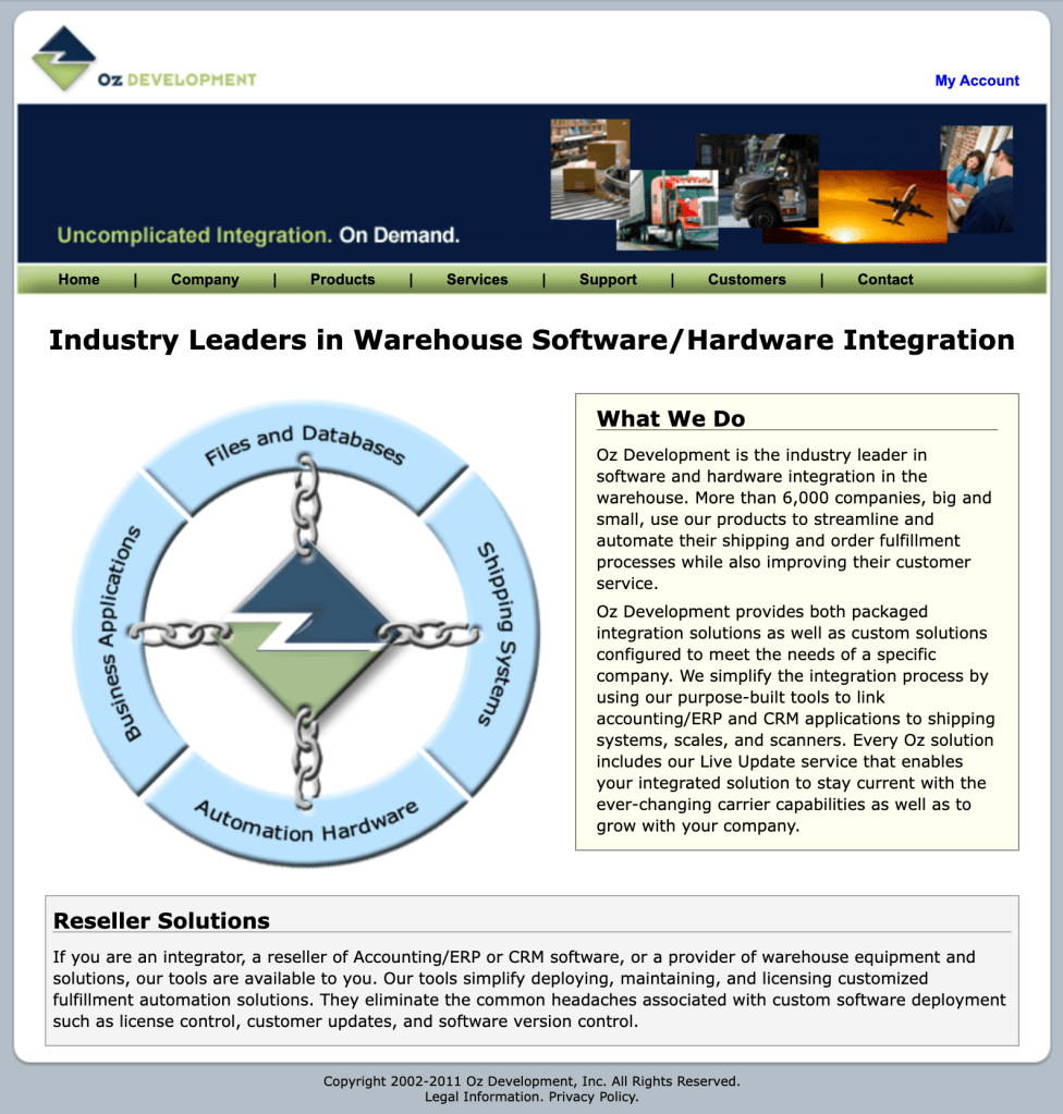


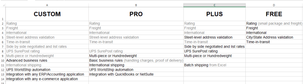
Oz, despite having some top customers such as Lionel, Lowe’s and Malibu Boats, had a few issues in that their UI was not polished, and it was difficult to determine what they were offering, even when examining their product comparison tables. This was preventing organic sales growth directly from the web site. Logistics apps were deeply complex in their underpinnings, and yet simple enough at a glance for users, but were not performing as well as expected in the field. Their customer base, in the same way, was not being showcased into use cases to show the incredible difference their software made possible with inventory and logistics.
Task
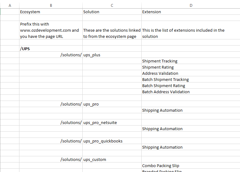
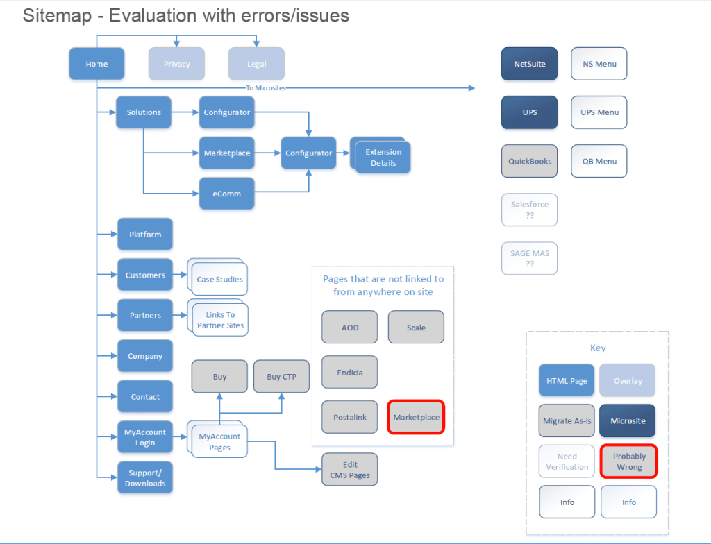
I began with an audit of the available web properties, apps, printed materials and to build a customer segment and solution matrix to begin clarifying what it is they were selling, and to tailor those offerings to the correct markets.
A basic refresh was performed with a logo redesign, a plan to re-brand the properties and presentation assets with a new modern color palette, as well as a framework to help the customer understand the product offerings by solution.
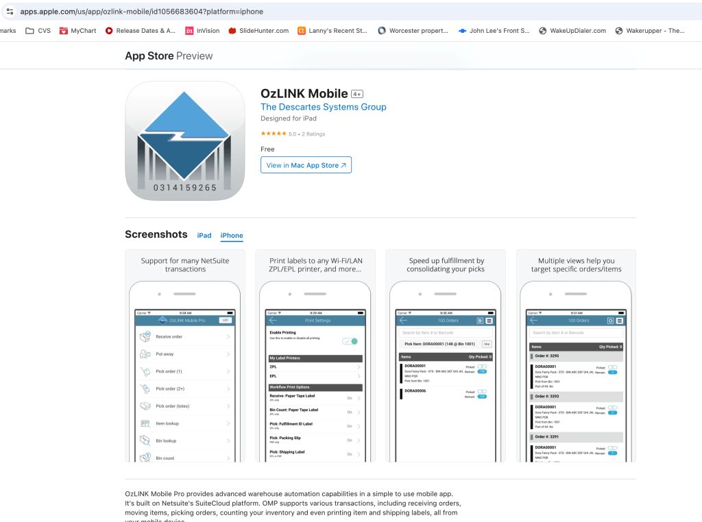
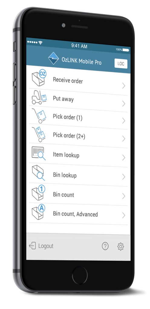
The mobile apps also received attention in the way of field studies, contrast ratio and other task performance issues being experienced live, in the field, to study what could be done to improve performance.
Action
After evaluating customer segments, product offerings and their classifications along with performing competitive analysis, we collectively reviewed and refined the information into logical groupings which made sense in the inventory and logistics marketplace. It was difficult to sell re-classification and rebranding of certain product names as Sales and Marketing had grown accustomed to the naming conventions, however, once the final organization of product offerings were presented in wireframes, diagrams and spreadsheets, the team was more easily able to “get” why we needed to clean the closets and start with a fresh sense of organization to their product and service offerings.

The mobile app presented its own unique challenges, as it was being used in the warehouse. Performing an on-site audit with a few customers, I learned that the normal visual contrast ratios for color palettes and standard “hit” or “target” areas commonly used in mobile apps would not work. Custom solutions were implemented for high and low contrast as well as improved target areas for buttons and tasks such as printing labels as many warehouse employees were wearing gloves, preventing them from accurately selecting “normal” sized targets.
Result
Creating style guides, new print and presentation materials for conferences and redesigning everything from their web properties to the warehouse applications was no small feat, but planned properly for the business, I was able to minimize any down-time, staged releases with the dev team, and ultimately rebranded all of Oz Development. The company sold for $29.5 million to Descartes Systems Group, which was a rousing success!


Leave a comment