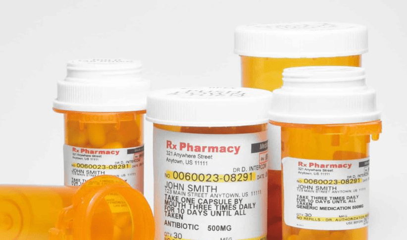
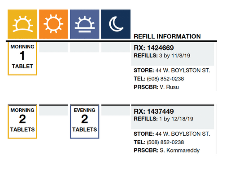
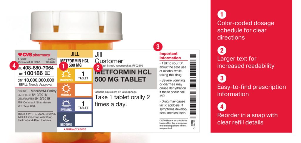
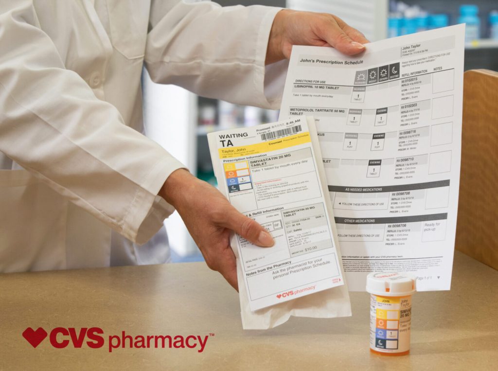
Prescription labels were text-laden, absent of iconography and particularly color. Many customers during user testing had a difficult time reading the labels small fonts and determining when they should take their medication. there were sentences detailing this, but it was determined we could lay out this information in a checklist style design where the time of day and frequency would be prominent, using a consistent hierarchy of more legible fonts, white space and color, paired with iconography to illustrate the frequency. We took suggestions from the field. We used competitive analysis and even tested the colors with color-blind members, to ensure it was not simply the color which was the indicator, but that easy to interpret iconography was representing the time of day. After 10 iterations, we landed on an approach which would be used on exterior packaging should the member choose to keep this for reference, and also finally incorporating these onto Rx labeling so each bottle or box would contain a permanent reminder for members. We received overwhelming user feedback in satisfaction surveys which praised the improved visibility with specifics, like customers remarking that they now could, “mentally picture when to take (their) medication” thanks to the illustrations, when they previously had a hard time simply reading the original sentences formerly used to describe critical things such as dosage and timing.